How to Use Information Architecture and Visualization Techniques to Communicate Complex Data
The growth of data is astounding. The International Data Corporation (IDC) predicts the Global Datasphere will evolve from 33 zettabytes in 2018 to 175 zettabytes by 2025. We live in a data-driven world, thanks to developments such as the internet, artificial intelligence (AI), machine learning (ML), advancements in sensor technology, monitoring, and so on.
As data becomes more valuable many businesses face the growing challenge of communicating key information in an easy-to-understand format.
The presentation of data can range from technical communication for internal employees who understand a topic, through to the education of a complex topic to external stakeholders with little or no understanding. The best communication medium in this case is often a clear visual presentation.
A solution to the problem is to leverage the power of information architecture and data visualization to develop communication tools, employing graphics and text to convey complex topics. This can take the form of infographics and handouts, through to traditional web applications, as well as interactive designs and presentations.
The best approach to develop such communication tools is via a clearly defined step-by-step, collaborative process between all relevant stakeholders. Once knowledge has been gathered for a new project, an initial conceptual map is the best starting point as the foundation for the final product.
The most effective process includes a continuous loop of feedback and revisions between key decision makers and stakeholders, until the product is finalized and approved. An example of this process includes:
Integrated Data Management for Effective Decision Making
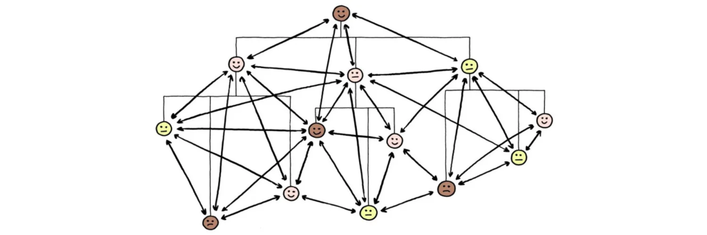
It can be a major challenge to collate large amounts of important information into a very limited space. Not only must the data communicate critical information, it must also be represented in a way that resonates with the end user.
The infographic shown is a recent example of a ARTISTA’s project. The objective was to create a visual for ARTISTA’s MediaLab team to explain to clients our digital first approach to integrated data management and how the technologies and jargon all fit together. To convey the message that everything is logically connected and sequential.
ARTISTA’s MediaLab, which specializes in information architecture and data visualization to support clients with complex data needs, worked with subject matter experts and key stakeholders to start with a basic concept and then evolved it into the final infographic. The final infographic simply and clearly illustrates the complex concepts of MediaLab’s approach.
The result from this infographic was that both ARTISTA stakeholders and our clients better understand the process and interactions, how digital services can address pain points and create efficiencies. Using infographics has the ability to create relationships that text and speech simply can’t do alone.
Solutions like this can help to break down the barriers of the technical communication gap by simplifying data. Infographics and well-designed visual aids can foster communication between people with different technical depth. They can develop a unique workflow to popularize complex topics for the general public. The key to success is to focus on the effectiveness of the result, over the nature of the content.
Looking to the future, it’s expected that more and more companies will adopt visual communication tools to help summarize an entire project on one page. Project managers will use these tools to present to senior staff and CEOs. We foresee visual tools as one of the key ways to escalate information throughout an organization. In the future complex projects and data will be captured visually to help present to key stakeholders.